
tips/tricks
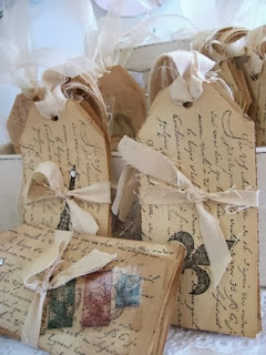
About photographing your cards:
1. Light: too much will wash out the details of your card and too little will darken your card and hide details. Getting the right amount is the tricky part. A small amount of shadow is a good thing. Trial and error.
The best tip I can give: PicMonkey.com
It is a free (although I use the upgraded "Royale" version that costs next to nothing), online software. I have been using it for years now.
This is basically what I do with every photo:
1. Crop at 10 x 8
2. Exposure (I play around with both Brightness and Highlights). I like to get them as bright as possible with out an "over exposed" look. I usually have them sitting at 11.
3. Sharpen (I usually do around 11% Sharpness)
The above is all in the free addition.
Sometimes I add a Burst of colour which is in the Royale version.
I also save my photo at a smaller resolution, otherwise no matter how much editing you do, it will be blurry.
Have fun with it!

Watercolour Tips: I like to use heavy watercolour paper (140+ lbs) as it buckles less. I keep an old hairspray bottle filled with water handy so I can spritz my watercolour paper first before adding the paint (pink in this example) as it keeps the paint very loose. I love how it bleeds into each layer of pink colour. After finishing the one pink flower, I would then let it completely dry. Next I will spritz the next flower (purple in this example) with my water bottle and start the process all over again and let that flower dry and so on. If you don't let the flowers dry separately then the pink flower would bleed into the purple (see photo below).
Watercolour Paper Warping Tips: After the WHOLE painting is dry I then will turn it over and spritz the BACK of the paper, making sure I get the whole back quite wet. Next I grab an open phone book, then place a piece of paper towel, next my watercolour painting face down, then a piece of wax paper, lastly another piece of paper towel, and then close up the book to press the paper flat. I then waited overnight to take it out but essentially it could have been taken out after 3+ hours. Voila! You have a FLAT piece of watercolour paper! Nothing bother me more than trying work with wonky paper! I have heard of people doing a low set iron but I have not tried that one yet (see photo below).
Vellum Heat Embossing Tips: Once you have your stamped image with embossing powder on the vellum, take your heat embossing tool and wave quickly (keep it moving!) back and forth underneath the vellum. There will be far less buckling if you keep your heat tool moving. If you do get a warp then heat from the top on the one spot. I then adhere my vellum piece to my card with a Martha Stewart glue pen as it dries completely transparent (see photo below).

About Ink Pads:
I have found a couple of helpful sites with hints, tips, and tricks:
When using archival inks, do remember that they can stain your stamps. You can buy solvent based cleaner or use rubbing alcohol to clean your stamps. Do remember alcohol will dry your rubber stamps (which you don't want) so I do recommend wiping your stamp with water after to clean off any trace of solvent or alcohol.
I can never remember what ink is for what!!!
From Cardmaker's Guide to Ink:
Dye-based inks
Dye-based ink is quick-drying and excellent for basic stamping.
It’s sold on a hard felt pad, which means it’s difficult to over-ink your
stamp, so it gives clean, crisp images – perfect for stamping outlines and
ideal for those new to stamping.
However, it’s useful to note that dye-based ink soaks into the
fibres of the paper rather than sitting on top, so you will get the brightest
effect if you use them on pale or white card, rather than dark coloured card
where the colour will blend in. Some dye-based inks are waterproof when dry,
some are not. If you want to watercolour over your stamped images, you’ll need
to use an ink labelled as ‘waterproof’ or ‘permanent’. Alternatively,
non-waterproof inks can be used as a colouring medium themselves – simply dab
some ink onto a tile, or similar surface, and apply the colour with a
paintbrush.
Also worth noting is that dye-based ink tends to fade over time.
To avoid this, look for ink pads labelled as ‘archival’ or ‘fade-resistant’.
Pigment
inks
Pigment inks are slow-drying and ideal for heat embossing, as
they allow enough time for the embossing powder to stick to the inked
area.
Unlike dye-based ink, pigment ink dries on the surface of the
card rather than soaking into the fibres, so the colours often look more
vibrant than dye-based inks. However, this means that they are not suitable for
basic stamping on coated or glossy card as the ink won’t dry. Only use them to
stamp on these surfaces if you heat emboss them afterwards.
Pigment inks are generally sold on a spongy pad so beware of over-inking
your stamps with them. There are also lots of exciting variations of pigment
inks available, such as shimmery and chalk finishes, which are fantastic for stamping colour on your cards.
Solvent-based
inks
Solvent-based inks are quick-drying, permanent inks. As they can
be used on any surface they are ideal for stamping on all kinds of card,
acetate, glass and even metal. Some manufacturers of clear stamps advise
against using solvent-based ink with their products, as the solvent can attack
the clear polymer over a period of time.
StazOn is a popular brand of solvent-based ink, as it has a mild
smell and is available in many colours.
Special inks
Some special inks have been developed
that deserve a mention for their unique mix of qualities.
VersaMark ink
VersaMark ink is a very sticky, clear pigment ink. It’s ideal
for heat embossing and other effects because embossing powder will stick to it
and as it is clear you can add any colour of powder to it.
Chalk ink
Chalk inks are a pigment ink which have a powdery, matte finish
once dry. They have the vibrance of a pigment ink but can be blended like a
dye-based ink, making them a popular choice with cardmakers.
Distress ink
These are dye-based inks with a higher concentration of colour
and a longer drying time than normal. They are designed to flow when sprayed
with water, and to be blended and worked into your project. They are ideal for
altered art and distress effects.
Alcohol inks
These are special dye-based inks designed to give a pretty,
polished-stone effect. They are quick-drying and permanent, and can be used on lots of surfaces including
glossy paper, acetate, shrink plastic, foil and metal.

Comments
Your cards show so beautifully on your blog.